ShopDreamUp AI ArtDreamUp
Deviation Actions


Suggested Deviants


Suggested Collections


You Might Like…


Featured in Groups


Description
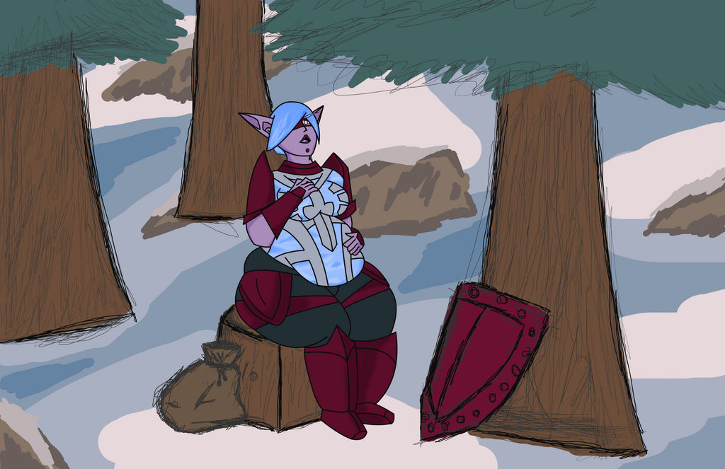
Part two! Falindre finds herself trying to catch her breath in a newly fattened form! Running is much harder when you've got extra pounds of elf to carry around, after all. Fit and proper no longer with a missing belt to boot!
Part one: alternativemethods.deviantart.… here!
After all parts are finished, I'll be writing a story to follow along, so there's that.
Now, if you've any tips to offer me or critique to share, don't be shy! Even if it's just telling me what parts worked and what didn't, any scrap of information is super appreciated, no matter how small.
And finally, the race and setting are not mine, they belong to the respectful owners at Blizzard; plz don't sue me!
Image size
12064x7808px 6.62 MB
© 2015 - 2024 AlternativeMethods
Comments6
Join the community to add your comment. Already a deviant? Log In
Lol damn dude this file size is actually making the image lag whenever I scroll back up to look at it XDDD.
Despite the relatively flat coloring you did for the character, the balance of color you dedicated to her outfit make those flat colors pop rather nicely, the electric blue in her torso offering a bright contrast to the the dark maroon and grey (though considering this is a Warcraft inspired character, I have no way of knowing how much was your design and how much was pre-made by the game). On closer examination you do actually have some nice shading that matches to a proper light source, but the values are too muted for a passerby to notice, I would suggest experimenting with darker values for shading and shadows.
While I'm on the subject of color I feel i must state the obvious that the quality of the character doesn't quite match that of the background, on the one had it does put emphasis on the character, but on the other it makes the world she's in look "fake". That said I give you points for including a background at all (something I tend to skimp out on ;w; ), plus the scenery does it's job to help imply a hint of story. So although flawed, the background is a good addition to the overall piece.
I've mentioned before that the red dot/chin ring is a bit of an odd character quirk for a female design, but in this particular scene her thick lips better balance the face for a more overall feminine look. Along similar lines I quite like the shape you gave her one visible eye, that sort of partially opened look to indicate fatigue or possible regret") . It's a cute little touch that gives her an equally cute expression.
. It's a cute little touch that gives her an equally cute expression.
And of course I cant mention cuteness without talking about that flabby little belly she has pooching out on her thighs . It's quite a noticeable change from her previous entry, pushing out far enough to actually cover part of her lap XP. Even so her belly's bulge is deceptively narrow when compared to how wide her hips and thighs reach by comparison, making her belly seem small by comparison despite it being able to fill her lap.
By the way is the blue part of her outfit meant to be armor or just cloth? I was under the impression that it was armor, but the way it deforms around the bulge of her belly suggests to me that it's cloth instead. The power of the belly is mighty, but I doubt it would be able to warp armor-caliber metal (unless it was magically made to fit her body shape as she grows or something, which would honestly feel a bit contrived unless she was planning on gaining weight).
Overall I'd say this piece was made in good fun with some nice details despite some flaws. A decent score with room to improve^^.
Despite the relatively flat coloring you did for the character, the balance of color you dedicated to her outfit make those flat colors pop rather nicely, the electric blue in her torso offering a bright contrast to the the dark maroon and grey (though considering this is a Warcraft inspired character, I have no way of knowing how much was your design and how much was pre-made by the game). On closer examination you do actually have some nice shading that matches to a proper light source, but the values are too muted for a passerby to notice, I would suggest experimenting with darker values for shading and shadows.
While I'm on the subject of color I feel i must state the obvious that the quality of the character doesn't quite match that of the background, on the one had it does put emphasis on the character, but on the other it makes the world she's in look "fake". That said I give you points for including a background at all (something I tend to skimp out on ;w; ), plus the scenery does it's job to help imply a hint of story. So although flawed, the background is a good addition to the overall piece.
I've mentioned before that the red dot/chin ring is a bit of an odd character quirk for a female design, but in this particular scene her thick lips better balance the face for a more overall feminine look. Along similar lines I quite like the shape you gave her one visible eye, that sort of partially opened look to indicate fatigue or possible regret
And of course I cant mention cuteness without talking about that flabby little belly she has pooching out on her thighs
By the way is the blue part of her outfit meant to be armor or just cloth? I was under the impression that it was armor, but the way it deforms around the bulge of her belly suggests to me that it's cloth instead. The power of the belly is mighty, but I doubt it would be able to warp armor-caliber metal (unless it was magically made to fit her body shape as she grows or something, which would honestly feel a bit contrived unless she was planning on gaining weight).
Overall I'd say this piece was made in good fun with some nice details despite some flaws. A decent score with room to improve^^.